When I started working on my first Kivy app I got to a point where I thought: “If only this widget could do this other thing”, and that’s how I came across the concept of Mixing and creating Custom Widgets. They both work combining the behaviors and properties from the basic widgets that come with Kivy. That way, you can give your application a more cohesive look, and save yourself some time.
In this post, I’ll walk you through the process of creating custom widgets step-by-step that you can integrate into your projects. I’ll also show how I organize my projects, and locate my custom widgets.
Planning your Custom Widgets
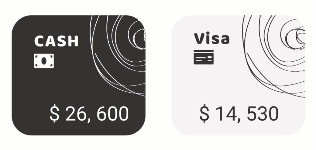
First, you need to decide the design, and functionality you want for your widget. For example, in this post, I’ll show the process of creating two custom widgets. The first will be a simple widget that shows the concept of Mixing widgets. The second is a more complex widget with full functionality and custom behavior. Below you can see the images for both widgets, on the left is the Mixin, and on the right is a more complex widget.

The first widget has an image and a label and has toggle functionality. The second is a card that also has toggle functionality and displays information that changes programmatically. Style-wise, its shape is a rounded card with a background image that inverts its color upon selection.
Once you have your design and know what functionality is required, you can decide on which approach to take, and the existing widgets that’ll be used. There are two possibilities, the first one is a Kvlang-only widget, and the second one is a Kvlang and Python widget. The choice between them is based on the complexity of the functionality needed, as we’ll see.
In our example, the first widget does not have any custom functionality needed so a custom Kvlang-only widget will be enough. As for the components, the root container for the widget will be a BoxLayout, and inside there’ll be an Image and a Label. To add the functionality needed, I’ll use the ToggleButton. The second widget, however, does require custom functionality (eg. Interaction with databases), and in these cases, a widget with a Python and a Kvlang component is usually best. The functionality is defined in the Python file, and the UI structures go on the Kvlang file, the same as with simple widgets. For the example widget, the UI is formed by a BoxLayout with Image and Label nested, plus the functionality of a ToggleButton.
Building your Custom Widgets
Language, Tools, and Placement
To build both our widgets we’ll use Kvlang, and for the second widget, we’ll also use Python. You can use any editor you like, and for this post, I’ll also assume that you already have a working Kivy project.
Now, regarding the location of custom widgets within projects, I normally have a dedicated components folder at the same level as my main files. Inside that folder, I have one folder per complex widget and a file called widgets.kv. In that file, I store all the simple widgets. Below is an example of the app folder from a wallet app I worked on some time ago.
app
├── components
│   ├── card
│   ├── transactionform
│   ├── transactions
│   ├── widgets.kv
│   └── __init__.py
├── lib
├── views
├── __init__.py
├── main.kv
└── main.pyHere you can see the main .py and .kv files, and components folder. Inside are folders for three custom widgets (Card, Transaction Form, and Transactions), and the widgets.kv file. There is also an init.py file since this is a module. Inside each complex widget folder, there is a .kv file, and a .py file with the name of the component (see example below).
card
├── __init__.py
├── card.kv
└── card.pyDesign and Layout
In both cases, the designing and layout will be done in Kvlang, and since we’ve already decided on the components that will be used I’ll just show the code for each design and discuss it.
Simple widgets | Simple Selector
[...]

<CategorySelector@BoxLayout+ToggleButton>
    orientation: 'vertical'
    background_normal: ''
    background_down: 'assets/img/select_square.jpg'

    Image:
        allow_strech: True

    Label:
        font_name: 'assets/fonts/Roboto-Regular.ttf'
        font_size: ('10sp')
        text_size: self.size
        halign: 'center'
        valign:'top'
size_hint: 1, 1First, and in between <>, I defined the name of the widget (in Pascal Case because is a Class), and specified the main components needed with a @ symbol between. In this case, I used the root component BoxLayout and ToggleButton to add functionality. After, I defined the inside structure of the widget and set the shared properties.
Note that I didn’t set the properties that are particular to each instance of the widget, image path for Image, and text for Label. Those will be set in the view that uses the widget.
Complex widgets | Card selector
As explained above, complex widgets consist of two files. Below is the .kv file, where I defined the UI structure.
#:import hex kivy.utils.get_color_from_hex

<Card>

    card_title: card_title
    card_image: card_image
    card_text: card_text

    orientation: "vertical"
    padding: [24, 24]
    spacing: 8
    on_state: root.change_state()

    canvas.before:
        Color:
            rgba: hex('#F2F2F2')
        RoundedRectangle:
            size: self.size
            pos: self.pos
            radius: [36]

    canvas:
        RoundedRectangle:
            size: self.size
            pos: self.pos
            radius: [36]
            source: "assets/img/card.png"

    Label:
        id: card_title
        text: 'CASH'
        font_name: 'assets/fonts/BalooBhai2-Bold.ttf'
        font_size: ('14sp')
        text_size: self.size
        halign: 'left'
        size_hint: 1, 0.24

    Image:
        id: card_image
        source: 'assets/img/cash.png'
        size_hint: None, None
        pos_hint: {'x': 0}
        size: self.texture_size

    Label:
        id: card_text
        text: '$ 0'
        font_size: ('16sp')
        font_name: 'assets/fonts/Roboto-Regular.ttf'
        text_size: self.size
        halign: 'right'
        valign: 'bottom'
First, I put the name in between <>, which is the root of the widget, and nested inside I put each of the components of the widget. Note that this time I did not put the @ symbol or the main components, this will be defined in the Python file. This time I also defined a default text for the Label widgets and a source for the Image widget. I chose to do this because, in the app context, this widget is programmatically generated and updated, so the labels and image sources change on generation.
Then, I defined three custom properties (card_title, card_image and card_text) just below the name and matched them with the id property of each of the components (Labels and Image). This is how you can identify each widget to be able to modify its properties using Python.
Interactivity
In the case of simple widgets, interactions with the widget are defined by the parent component capabilities (eg. the on_press method for buttons). For complex components, custom functionality is added to its Python file. Below is the sample for the Card component.
from kivy.graphics import Color, RoundedRectangle
from kivy.uix.boxlayout import BoxLayout
from kivy.uix.behaviors import ToggleButtonBehavior
from kivy.utils import get_color_from_hex as hex_color

from lib.variables import account_type, currency_format


class Card(ToggleButtonBehavior, BoxLayout):
    """
    Class representing a card with each account stats.
    """

    def __init__(self, **kwargs):
        super(Card, self).__init__(**kwargs)

    def update_card(self, data: dict[str, str]):
        """Sets parameters for the information shown in the card.

        Args:
            data (dict[str, str]): Dictionary with the data to be shown in the card
        """
        self.ids["card_title"].text = data["account_name"].upper()
        self.ids["card_image"].source = account_type[data["account_type"]]
        self.ids["card_text"].text = currency_format[data["account_currency"]].format(
            data["account_balance"]
        )

        return self

    def change_state(self):
   """Updates UI upon state change"""
        card_data = {
            "card_title": self.ids["card_title"].text,
            "card_image": self.ids["card_image"].source,
            "card_text": self.ids["card_text"].text,
        }

        if self.state == "down":
            with self.canvas.before:
                Color(0.2, 0.2, 0.2, 1)
                RoundedRectangle(size=self.size, pos=self.pos, radius=[36])

            with self.canvas:
                RoundedRectangle(
                    size=self.size,
                    pos=self.pos,
                    radius=[36],
                    source="assets/img/card_black.png",
                )

            self.ids["card_title"].color = hex_color("#FDFDFD")
            self.ids["card_image"].source = card_data["card_image"].replace(
                ".png", "_white.png"
            )
            self.ids["card_text"].color = hex_color("#FDFDFD")
        else:
            with self.canvas.before:
                Color(0.949, 0.949, 0.949, 1)
                RoundedRectangle(size=self.size, pos=self.pos, radius=[36])

            with self.canvas:
                RoundedRectangle(
                    size=self.size,
                    pos=self.pos,
                    radius=[36],
                    source="assets/img/card.png",
                )

            self.ids["card_title"].color = hex_color("#333333")
            self.ids["card_image"].source = card_data["card_image"].replace(
                "_white.png", ".png"
            )
self.ids["card_text"].color = hex_color("#333333")This is the Python file and is where we define the custom component. It is defined as a Class that inherits from the main widgets that form our component, in this case, BoxLayout, and ToggleButton. Inside, the class defines three methods: __init__, update_card, and change_state. The __init__ method initializes the parent classes, and the following two are custom behaviors.
These custom methods are how I interact with the widget. In the example, the first method is called when the widget is first created, and whenever there is a change in the database. Here you can see how the IDs are accessed to change the information being displayed. In the second method, the UI is updated when the button changes state.
Integrating Custom Widgets into the App
Once the widgets are ready, we need to import them into the application. In both cases, the Kvlang files are imported into main.kv with the following statements.
#:include components/widgets.kv
#:include components/card/card.kvThis allows for the widgets to be used in any Kvlang file across the application. Below you can see the example for the simple widget.
<TransactionForm>
[...]
    GridLayout:
    [...]
        CategorySelector:
            on_press: root.set_category('food')
            group: 'category'
            Image:
                source: 'assets/img/categories/type_food.png'
                size_hint: None, None
                size: self.texture_size
                pos_hint: {'center_x': 0.5}
            Label:
text: 'food'Here you can see the widget in context, used inside a Grid Layout. Note that the name is not between <>, since it’s not being defined as root. Also, it is here that the source path and text are defined for the inner components. For interactivity, the on_press property of the widget calls root, this refers to the root of the whole tree TransactionForm (which is itself a custom widget).
Now, for complex components, you need to import the Python Class when you are going to use it. Here is an example of usage.
from components.card.card import Card
[...]

class HomeScreen(Screen):
    def __init__(self, **kwargs):
        super(Screen, self).__init__(**kwargs)

    def show_accounts(self):
        accounts = local_user.accounts

        if accounts != None:
            for account in accounts.each():
                account_card = Card(group="accounts").update_card(account.val())
                self.ids["accounts_slider"].add_widget(account_card)

[...]In this case, the widget is part of a slider with an accounts_slider ID, and it’s created once some information is successfully retrieved. Then the widget is added as a child of the slider with the add_widget method.
Conclusion
This is how you can create and integrate custom widgets into your Kivy applications. First, you need to determine if it’s a simple or custom widget. If it’s simple, you put it in the widgets.kv file, if not, you create a folder in your components folder, with the custom widget’s name and create the .kv and .py files. After that, you define the layout in the .kv files (both cases), and the custom functionality in the widgets .py file for the complex components. Finally, you import the widgets .kv file into main.kv, and the Python Class in the file you want to use it.
If you would like to delve deeper into some code and see examples, I have two repos with Kivy apps: an Expenses Tracker and a puzzle game called Cadaver Exquis. Additionally, I’ve created a guide on how to implement Screen Navigation if you’d like to read it.
Have a nice 2024! Happy coding.
Andrea